In a world where visual storytelling defines brand success, billboard mockups have become an essential tool for designers, marketers, and businesses. They allow you to visualize campaigns in real-life environments before investing in production. Choosing the right mockup, however, is more than just picking a nice image—it’s about aligning visuals with your brand identity and message.
Why Billboard Mockups Matter
Billboards are powerful because of their scale and visibility. A well-designed mockup helps you simulate that impact and refine your concept before it goes live. Whether you’re pitching to a client or building your portfolio, using a high-quality Billboard mockup can make your work feel tangible and professional.
Key Factors When Choosing a Billboard Mockup
Not all mockups are created equal. The right one should enhance your design—not distract from it.
- Context matters: Urban, highway, or indoor settings should match your target audience
- Lighting and realism: Natural shadows and reflections make your design believable
- Perspective and angle: Choose a view that highlights your message clearly
- Resolution quality: High-resolution files ensure crisp presentation
Matching Mockups to Brand Identity (Detailed Guide)
Choosing a billboard mockup that fits your brand identity is a strategic step that shapes how your message is perceived. The environment, lighting, and style should reflect your brand’s personality and values.
Start by defining your brand character—minimal, bold, luxury, or playful. A premium brand works best with clean, elegant scenes, while a молодежный бренд benefits from dynamic urban visuals. The mockup should instantly “feel” like your brand.
Next, think about your audience. The setting must match their lifestyle and expectations. A city-center billboard suits business audiences, while outdoor or lifestyle scenes appeal to casual consumers.
Color and mood also play a major role. Warm tones create a friendly feel, while dark contrasts suggest exclusivity. The background should support your design, not compete with it.
Keep in mind simplicity and readability. If your design is minimal, choose uncluttered mockups. For richer visuals, use detailed environments carefully.
Perspective matters too. Close-ups highlight design details, while wide shots show real-world context.
Finally, maintain consistency across campaigns. Using similar styles strengthens recognition and builds a cohesive brand image.
Real-World Use Cases of Billboard Mockups
Campaign Presentations
Agencies use mockups to present concepts in realistic settings, helping clients better understand scale, placement, and visual impact before launch.
Portfolio Enhancement
Designers elevate their portfolios by showcasing work in real-world scenarios, making projects feel more professional and convincing.
Pre-Launch Testing
Brands compare multiple design versions across different environments to identify the most effective visual solution.
Social Media Marketing
Mockups help create anticipation by previewing campaigns in a realistic way without revealing actual installations.
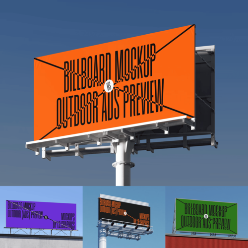
Billboard Mockups on the ls.graphics Website
The collection available on ls.graphics stands out for its attention to detail and usability. Their billboard mockups are crafted with premium quality and ultra-realistic rendering, making them ideal for professional presentations.
You’ll find organized layers for easy editing, multiple angles for diverse perspectives, and a wide range of color styles. The compositions are stylish and minimalistic, keeping the focus on your design.
The Edit Online feature allows quick customization прямо в браузере, while a large selection of free scenes lets you experiment before choosing premium options.
Tips for Getting the Most Out of Your Mockup
To truly maximize the impact of your billboard mockup, it’s important to think beyond simply placing your design into a scene. Each detail affects how your message is perceived.
- Keep your design bold and readable from a distance
Billboards are often viewed quickly and from far away. Use large fonts, clear shapes, and strong hierarchy so your message remains legible even at a glance. - Avoid overcrowding with too much text
A common mistake is trying to say too much. Focus on one key message or call to action. Clean layouts are easier to process and more memorable. - Use high-contrast colors for visibility
Strong contrast between text and background ensures your design stands out in different lighting conditions, whether it’s a bright day or nighttime scene. - Test your design across multiple mockups
Placing your design in different environments helps you see how it performs in various contexts and reveals which version communicates most effectively.
Conclusion
Choosing the perfect billboard mockup is about combining strategy with creativity. From matching brand identity to testing visual impact, every step shapes how your message is experienced. With high-quality tools and resources like ls.graphics, designers can confidently present ideas and bring campaigns to life with clarity and style.